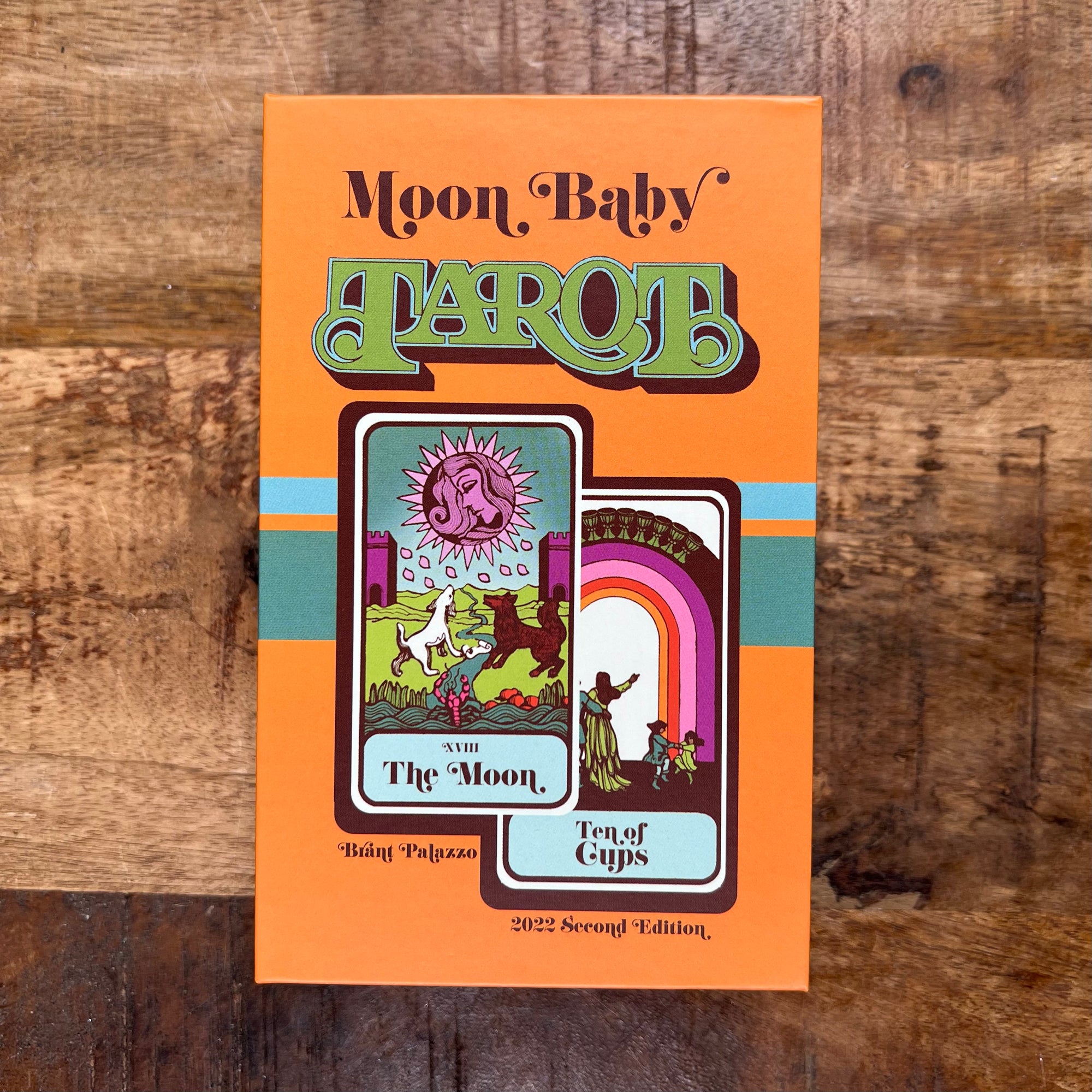
Moon Baby Tarot
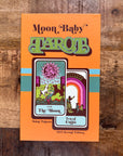
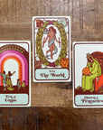
Step back into the ‘70s with this updated version of the Hoi Polloi tarot.
From the creator:
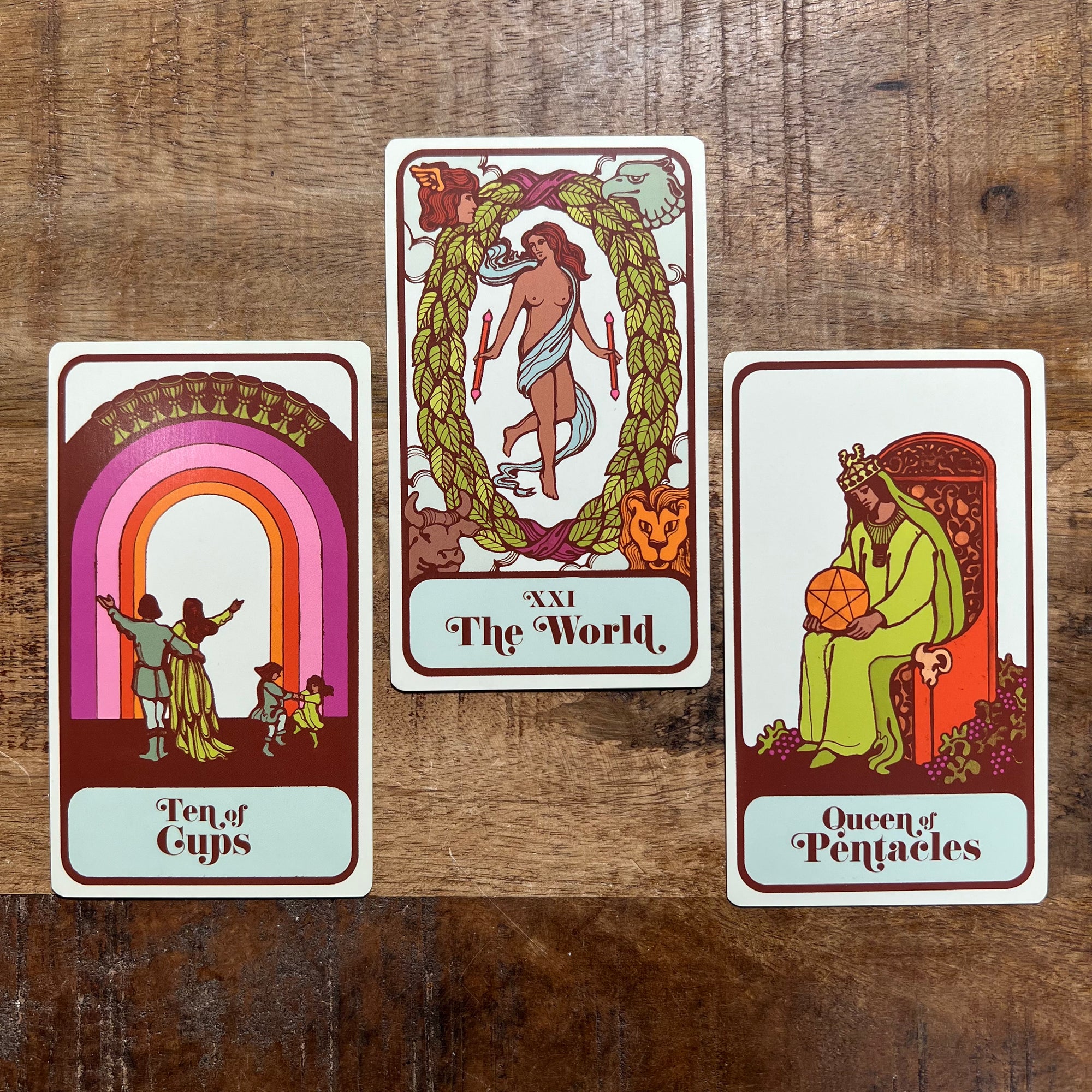
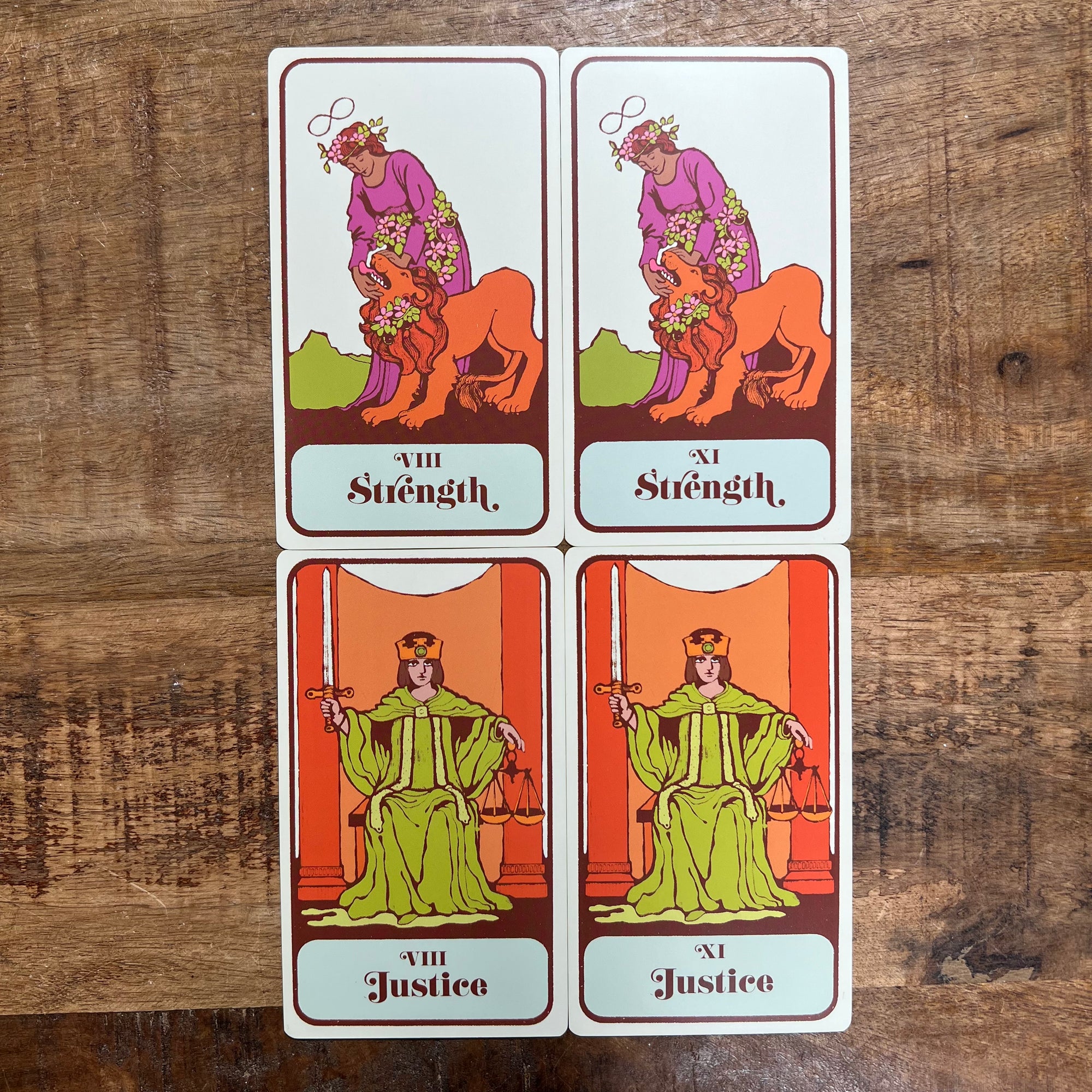
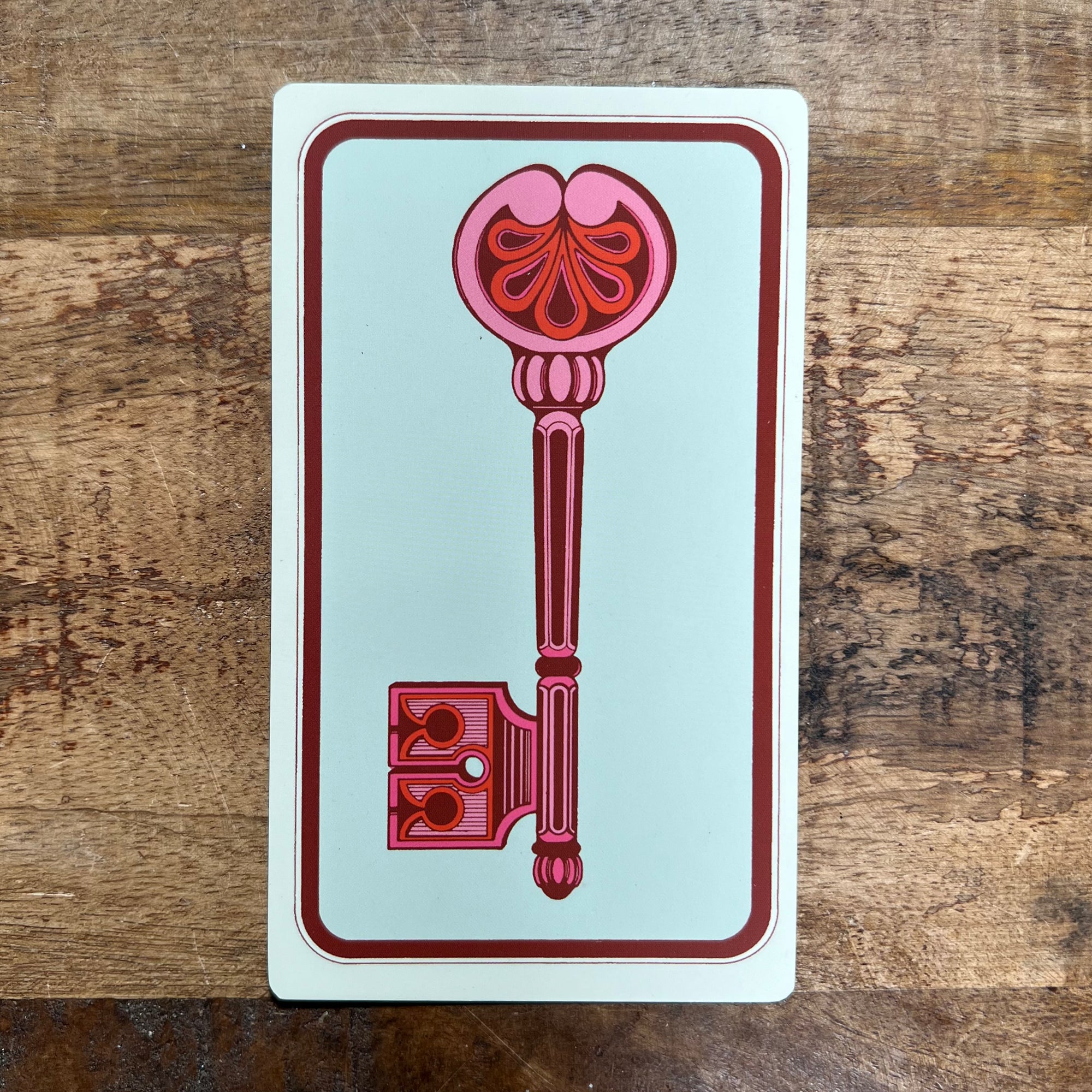
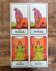
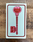
When I first got my hands on the Hoi Polloi I fell in love. Being over 50 years old it, of course, has its quirks. The quality of the printing isn't the best and the cardstock is thin and difficult to shuffle. I knew I could improve its quality to contemporary standards while preserving its midcentury aesthetic. I worked for months recoloring and reformatting the images so they could be printed in modern tarot dimensions. I cleaned up the line work but didn't add or take away any of the original image. The original old gothic font didn't suit the style of the deck so I replaced it with a fun '70s style font. The result is a fun, updated take on a classic vintage deck.
Click here to watch the deck flip-thru
Cardstock is incredibly important to me as a tarot collector and reader. The cardstock was one of most widely complemented parts of the first edition deck. The cardstock for this edition is the exact same.
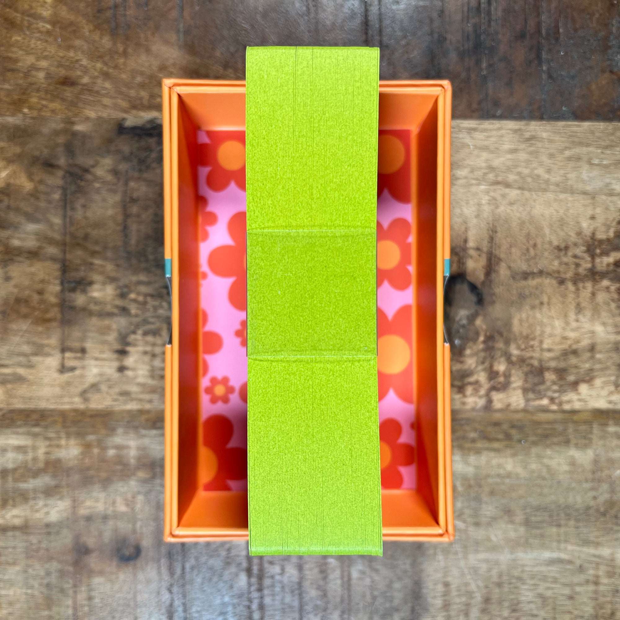
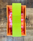
I wanted the second edition of the deck to have a fun element that would make the deck fun to collect. I didn't change anything about the cards themselves except the edge color. The edges of the deck are a groovy 70s Avocado green. The Box also got a fun new color.

